🔗 Github Code
🔗 Dataset Source
Intro
Support Vector Machines are one of the best machine learning methods when getting the correct answer is a higher priorty than understanding why you get the correct answer.Support Vector Machines are great with small datasets, but not awesome with large ones, and this dataset, while not huge, is big enough to take a long time to optimize with Cross Validation. So we’ll downsample both categories, customers who did and did not default, to 1.000 each. First, let’s remind ourselves how many customers are in the dataset.
Dataset
- Dataset: 29,932 samples is a relatively large number for a Support Vector Machine, so let’s downsample. To make sure we get 1,000 of each category, we start by splitting the data into two dataframes, one for people that did not default and one for people that did.
Data Modelling
Optimize Parameters with Cross Validation and GridSearchCV. Optimizing a Support Vector Machine is all about finding the best value for gamma, and, potentially, the regularization parameter, C. So let’s see if we can find better parameters values using cross validation in hope that we can improve the accuracy with the testing dataset.
Building, Evaluating, Drawing and Interpreting the Final Support Vector Machine
Since we have two parameters to optimize, we will use GridSearch(CV). We specify a bunch of potential values for gamma and C, and GridSearchCV() tests all possible combinations of the parameters for us. In the confusion matrix, we see that of the 257 people that did not default, 201 (79%) were correctly classified. And of the 243 people that defaulted, 148 (61%) were correctly classified. So the Support Vector Machine was not awesome. The SVM result is not significantly improved even after hyperparameter tuning.
PCA
So we see that there are 24 features, or columns, in X. This is a problem because it would require a 24-dimensional graph, one dimension per feature used to make predictions, to plot the data in its raw form. If we wanted to, we could just pick two features at random to use as x and y-axes on our graph, but instead, we will use PCA (Principal Component Analysis) to combine the 24 features into 2 orthogonal meta-features that we can use as axes for a graph.
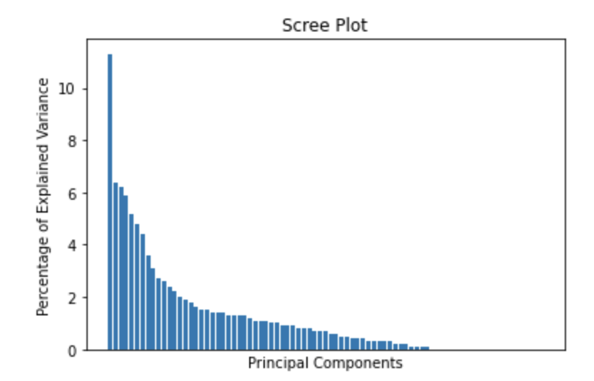
However, before we shrink the graph, let’s first determine how accurate the shrunken graph will be. If it’s relatively accurate, than it makes sense to draw the 2-Dimensional graph. If not, the shrunken graph will not be very useful. We can determine the accuracy of the graph by drawing something called a scree plot.
 scree plot: - In multivariate statistics, a scree plot is a line plot of the eigenvalues of factors or principal components in an analysis. The scree plot is used to determine the number of factors to retain in an exploratory factor analysis (FA) or principal components to keep in a principal component analysis (PCA).
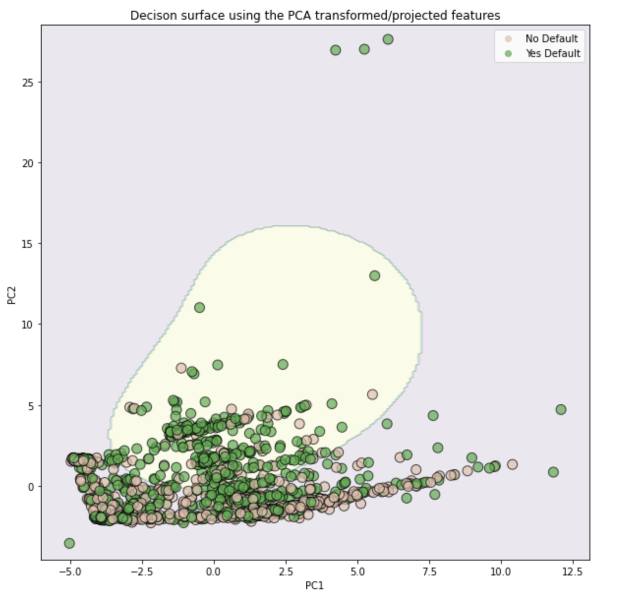
 The pink part of the graph is the area were all datapoints will be predicted to have not defaulted. The yellow part of the graph is the area where all datapoints will be predicted to have defaulted. The the dots are datapoints in the training dataset and are color coded by their known classifications: peach is for those that did not default and green is for those that defaulted.
NOTE: The results are shown the training data, not the testing data and thus, do not match the confusion matrices that we generated. Also, that for this picture, we only fit the SVM to the first two principal components instead of all the data, and thus, this is only an approximation of the true classifier. Lastly, because the skree plot showed that PC2 was not very different from PC3 or PC4, this is not a very good approximation.
